Introduction
In the fast-paced world of digital marketing, email remains a powerful tool for connecting with customers and driving business growth. While the email body content often takes center stage, the often-overlooked email footer can be a critical component in creating a cohesive and impactful communication. A well-designed email footer can not only convey important information but also reinforce your brand identity and encourage further engagement.
In this comprehensive guide, we’ll explore 10 stellar email footer examples from leading brands and unpack the strategies and best practices that make them so effective. By delving into these inspiring case studies, you’ll gain valuable insights to elevate your own email marketing efforts and create footers that captivate your audience and drive meaningful results.
Understanding the Role of Email Footers
An email footer, often referred to as an email signature, is the section that appears at the bottom of your email message. Contrary to popular belief, this space is much more than just a place to include your contact details or legal disclaimers. A thoughtfully crafted email footer can serve as a powerful extension of your brand, conveying key information, driving conversions, and fostering deeper connections with your subscribers.
At its core, the email footer should strike a delicate balance between providing essential information and maintaining a visually appealing, on-brand design. By strategically incorporating elements such as your company logo, social media links, calls-to-action, and even expressions of gratitude, you can transform this often-overlooked real estate into a valuable marketing asset.
10 Inspiring Email Footer Examples
Let’s dive into 10 exceptional email footer examples that demonstrate the power of this often-underutilized email component. From sleek and minimalist designs to feature-rich footers, these examples will leave you inspired and eager to elevate your own email marketing efforts.
1. AWeber
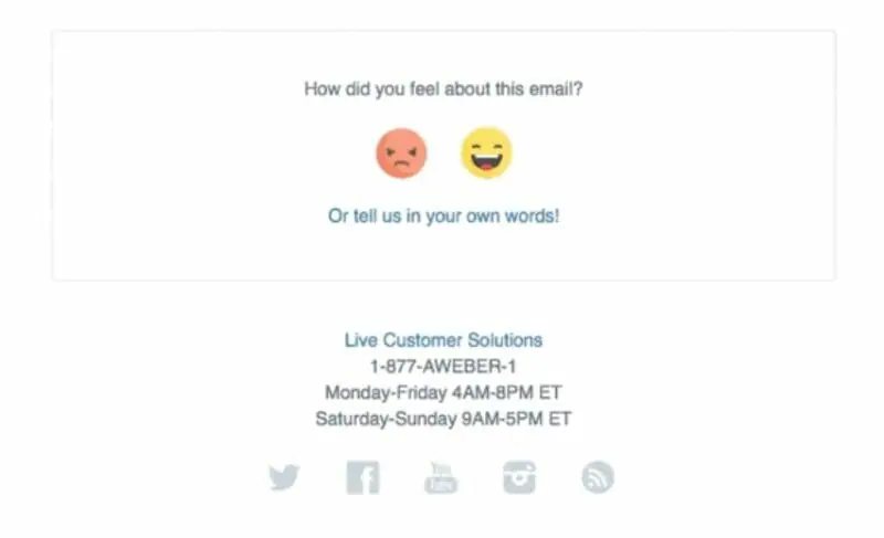
AWeber’s email footer takes a unique approach by incorporating an interactive element that encourages audience engagement. By including emojis that allow recipients to provide feedback on the email, AWeber fosters a sense of connection and demonstrates their commitment to understanding their subscribers’ preferences. This simple yet effective tactic can be a powerful way to gather valuable insights and improve future email campaigns.
2. Elle Johnson Co.
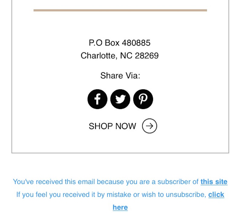
Elle Johnson Co.’s email footer takes a focused approach, prioritizing social media engagement over other elements. By prominently featuring share buttons, the brand encourages subscribers to become brand ambassadors and extend the reach of their marketing messages. This strategy can be particularly effective for businesses looking to leverage the power of social proof and word-of-mouth marketing.
3. Forever 21
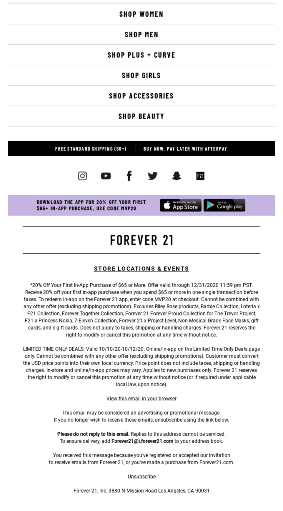
The Forever 21 email footer is a testament to the value of incorporating multiple calls-to-action. By including links to their online store, mobile app, and social media channels, the brand gives recipients a variety of options to engage with their brand further. The strategic placement of these CTAs, combined with the visually appealing layout, creates a cohesive and compelling footer that aligns with the brand’s overall marketing objectives.
4. Grammarly
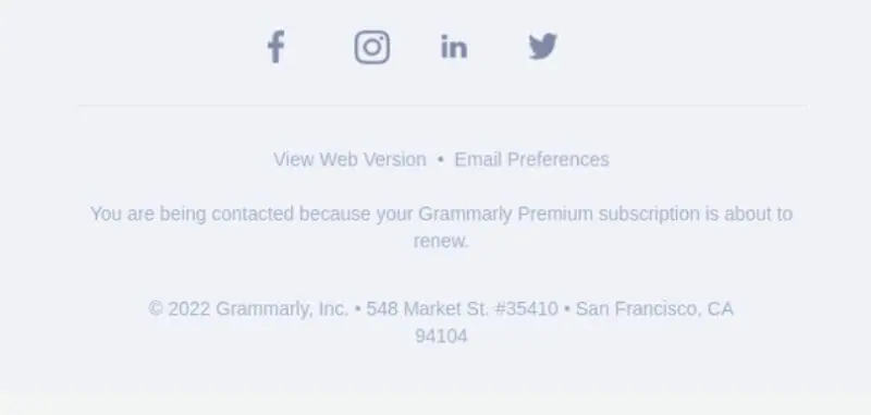
Grammarly’s email footer exemplifies the power of simplicity. By focusing on a clean, minimalist design that prominently features their social media icons and a clear unsubscribe link, the brand conveys a sense of professionalism and trustworthiness. This approach can be particularly effective for businesses that want to maintain a polished, no-frills image while still providing essential information to their subscribers.
5. DC Shoes
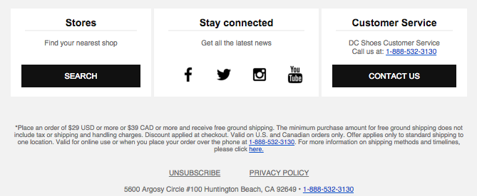
The DC Shoes email footer showcases the power of clean, organized design. By dividing the footer into distinct sections, each with a clear purpose, the brand makes it easy for readers to quickly locate the information they need, whether that’s store locations, social media links, or customer service details. The well-structured layout and strategic use of whitespace contribute to an overall professional and user-friendly experience.
6. Headspace
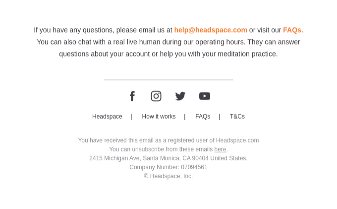
The Headspace email footer stands out for its emphasis on customer support and resources. By including prominent links to their FAQ section and a clear statement about their customer service availability, the brand demonstrates a commitment to providing a high-quality user experience. This attention to detail can help build trust and loyalty among Headspace’s audience, reinforcing the brand’s positioning as a trusted partner in their customers’ wellness journeys.
7. Local Eclectic
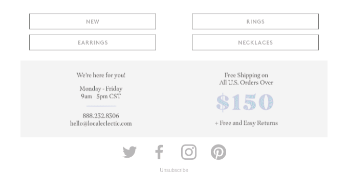
Local Eclectic’s email footer showcases the power of visual branding. The muted color palette and clean, minimalist design elements align seamlessly with the brand’s overall aesthetic, creating a cohesive and visually appealing experience for subscribers. By prominently featuring their free shipping and returns policies, the brand also addresses key customer concerns, further enhancing the overall value proposition.
8. Monica Vinader
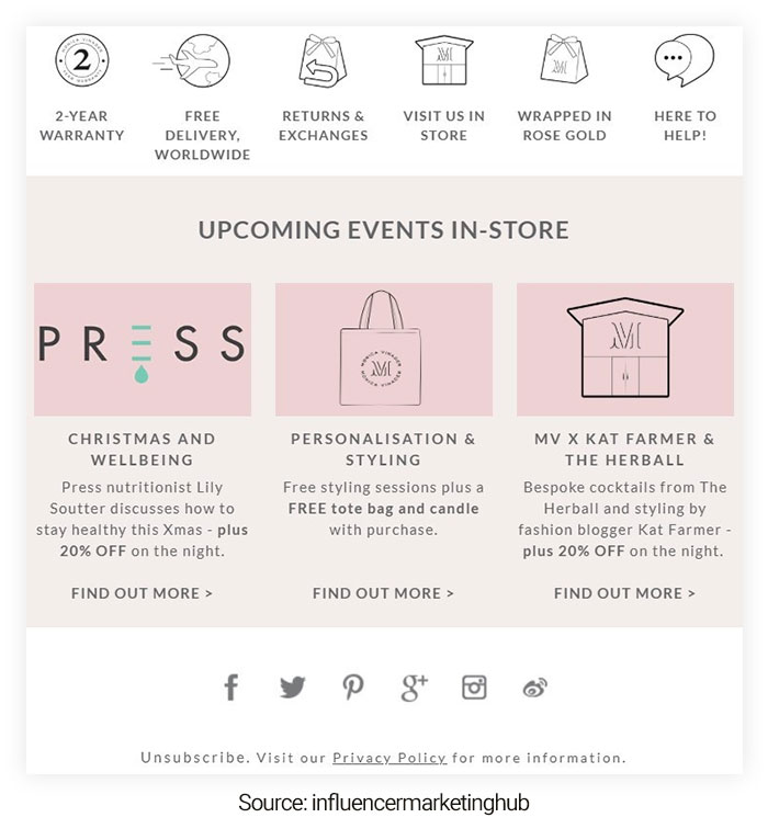
The Monica Vinader email footer takes a more comprehensive approach, incorporating a variety of elements that reinforce the brand’s identity and value proposition. From the prominent display of their brand values to the inclusion of upcoming event information, this footer serves as a comprehensive hub for engaging with the brand on multiple levels. The strategic use of icons and visual cues helps to break up the content and make it easily digestible for readers.
9. Patagonia
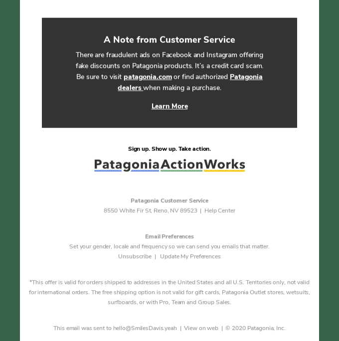
Patagonia’s email footer stands out for its focus on social responsibility and environmental activism. By using this valuable real estate to highlight the brand’s involvement in important causes, Patagonia demonstrates its commitment to making a positive impact. This approach not only aligns with the brand’s core values but also resonates with environmentally conscious consumers, strengthening the connection between the brand and its target audience.
10. Apple
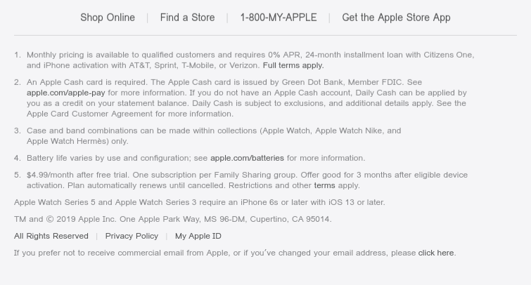
Apple’s email footer exemplifies the importance of providing a clear and intuitive navigation menu. By including links to their product lines and support resources, they make it easy for recipients to quickly access the information they need, even after scrolling through the email’s content. The strategic placement of these links at the bottom of the message ensures that users don’t have to search for them, enhancing the overall user experience.
Key Strategies for Crafting Effective Email Footers
Now that we’ve explored some of the best email footer examples, let’s dive into the key strategies and best practices that can help you create footers that captivate your audience and drive results.
Keep it Simple and Scannable
In the world of email marketing, less is often more. When it comes to your email footer, resist the temptation to cram in every possible piece of information. Instead, focus on the essential elements that your subscribers need, and present them in a clean, easy-to-scan format. By maintaining a minimalist approach, you can ensure that your footer is visually appealing and easy for readers to navigate.
Optimize for Mobile
With the majority of email opens occurring on mobile devices, it’s crucial to design your email footer with mobile-friendly considerations in mind. Ensure that your text is legible, your links are large enough to be easily tapped, and your overall layout is responsive to different screen sizes. By prioritizing mobile optimization, you can enhance the user experience and increase the chances of your subscribers engaging with your content.
Incorporate Trackable Links
Your email footer presents an excellent opportunity to drive further engagement and measure the effectiveness of your marketing efforts. By including trackable links, such as those leading to your website, social media profiles, or specific promotional offers, you can gather valuable data on your subscribers’ behavior and preferences. This information can then be used to refine your email marketing strategy and optimize future campaigns.
Leverage Branding Elements
Your email footer is an extension of your brand, so make the most of it by incorporating key branding elements. This can include your company logo, color scheme, and even brand-specific imagery or icons. By maintaining a consistent visual identity across your email communications, you can reinforce your brand’s recognition and build a stronger emotional connection with your audience.
Personalize and Customize
While email footers often contain standardized information, such as contact details and legal disclaimers, consider ways to personalize and customize this section to better reflect your brand’s personality and values. This could involve adding a friendly sign-off, including a motivational quote, or showcasing your team’s achievements. By infusing your email footer with a touch of individuality, you can create a more memorable and engaging experience for your subscribers.
Prioritize Compliance and Transparency
In the ever-evolving landscape of digital marketing, it’s essential to ensure that your email footer complies with relevant regulations and industry standards. This may include prominently displaying an unsubscribe link, providing your physical mailing address, and adhering to anti-spam laws. By demonstrating a commitment to transparency and responsible marketing practices, you can build trust and credibility with your audience.
Test and Optimize
As with any aspect of your email marketing strategy, it’s important to continuously test and optimize your email footer. Experiment with different designs, CTAs, and placements to determine what resonates best with your audience. Analyze metrics such as click-through rates, engagement levels, and unsubscribe rates to identify areas for improvement and refine your approach over time.
15 Top Price Drop Emails with Practical Tips and Examples
Conclusion
The email footer may seem like a minor component of your email marketing efforts, but it can have a significant impact on the overall success of your campaigns. By drawing inspiration from the 10 exceptional examples showcased in this article and implementing the key strategies outlined, you can elevate your email footers to become powerful tools for brand reinforcement, customer engagement, and driving meaningful conversions.
Remember, the email footer is not just a formality – it’s a valuable opportunity to leave a lasting impression on your subscribers. By crafting footers that are visually appealing, informative, and aligned with your brand’s identity, you can create a cohesive and compelling email experience that keeps your audience engaged and eager to interact with your business.
So, take the time to review your current email footer design, identify areas for improvement, and implement the strategies and best practices highlighted in this guide. Your audience, and your bottom line, will thank you for the effort.

